The Greatest Bubble Ever
Charlie Munger (December 2020) commenting on the NADAQ: “Well, nobody knows when bubbles are going to blow up, but just because it’s NASDAQ, doesn’t mean it’ll have another run like this one very quickly again. This has been unbelievable. Again, there’s never been anything quite like it. … It’s been the most dramatic thing that’s almost ever happened in the entire world history of finance.”
The Short Version
I realize many of are not interested in the details, so let me summarize the situation:
- U.S. equity valuations by most metrics have eclipsed the 2000 bubble to be the highest ever.
- Professional investment manager aggressiveness by several important metrics is the highest ever.
- Retail investor euphoria by several important metrics is the highest ever.
- IPO issuance (when combined with SPACs) has eclipsed 2000 and is the highest ever.
- I personally think the amount of fraud and misleading “adjusted” numbers coming from U.S. companies is among the highest ever.
- Bond prices with more than $18 trillion of negative rate bonds are the most expensive ever.
- Corporate credit-to-GDP is the highest ever.
- The quality of corporate debt is the lowest ever (more firms are one notch above junk than ever).
- U.S. government debt as a percent of GDP is the highest ever.
- The Federal Reserve’s money printing is the highest ever.
- Small business, which employs roughly half of Americans, closings are the highest ever.
- The performance and now valuation difference between glamour “growth” stocks and hated “value” stocks is the most extreme ever. (This is a great thing going forward for value investors!)
The short take is that financial markets have been seduced by the idea that governments and central bankers can paper-over all our problems and things will be fine. While this has “worked” for the stock market for the last 10 years, it has left us in an extremely dangerous situation. This type of aggressive money printing/debasement has never been successful in the history of humanity back to Athenian days.
In the same December interview referenced above, Charlie Munger said, “Nobody has gotten by with the kind of money printing we’re doing now for a very extended period without some trouble. And I think we’re very near the edge of playing with fire.”
Do we know when this bubble will pop? NO
Do we know how high it will go before it pops? NO
Can we be confident based on history, math and reason that it will pop? YES!
Now for those of you who want the gory details …
Have questions? Let’s talk! Contact Opus Wealth Management and get the conversation started.
I. Highest U.S. Equity Valuations Ever
While the international and emerging markets asset classes are not at record expensiveness, most indicators suggest that U.S. equities are their most expensive ever.
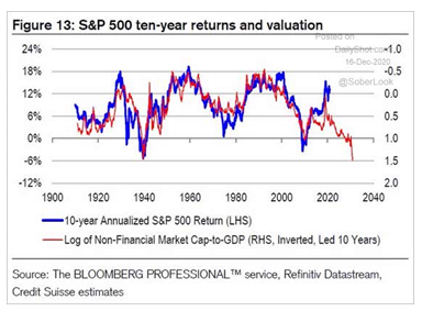
Recently, we have passed the record for highest valuations for U.S. stocks using my favorite (and I believe somewhat conservative) valuation metric:
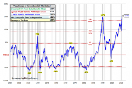
If you believe this cherry picking, let me show the metric that has the best historical accuracy that I’ve ever seen (an 89 percent correlation to forward 12-year returns) from Dr. John Hussman:
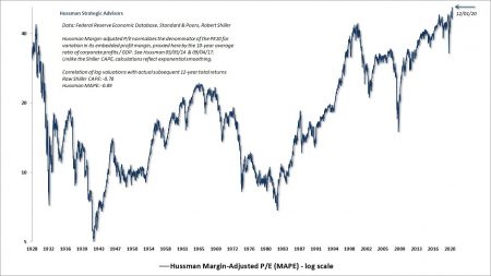
The above Margin Adjusted P/E (MAPE) takes all cyclicality out of earnings, which is what causes most of the “noise” in valuation metrics. If you want to see what a broader set of metrics look like relative to history, here you go (still for U.S. equities):
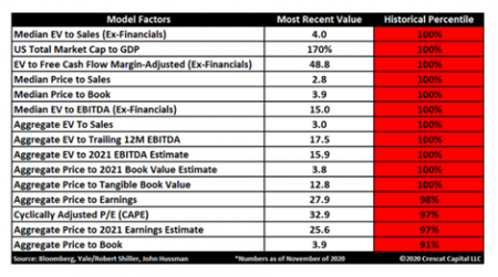
While no single valuation metric is perfect, I hope I’ve convinced you that it’s very easy to argue this is, quantitively at least, the biggest stock bubble in U.S. history. (This was all before Tesla joined the S&P 500, a low/no-earning mega-cap)
The implications of this are simple. Stock market returns can be broken down into this equation:
Total Stock Returns = Valuation change + growth + dividend yield
Dividend yield: The dividend yield on the S&P 500 is something like 1.6 percent as opposed to its historical average of more than 4.5 percent. So right there, you’re losing almost 3 percent in total return. Why? Mostly because corporate America distributes a certain dollar amount a year that grows roughly in line with the economy; the yield is largely a function of the prices of stock; the higher the price, the lower the yield.
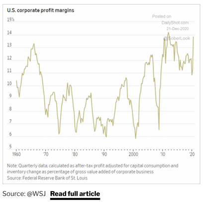
Growth: Let’s focus on earnings growth right now, which is a function of GDP growth. Earnings cannot outpace GDP forever or earnings would eventually eclipse the entire economy. In fact, today, earnings are at some of the highest percentage of the economy ever (see chart below). This is due to a few secular forces that have helped corporations earning unusually high profits; namely low interest rates, low taxes, low power of labor and low regulation (against monopolistic powers).
So, if we make the optimistic assumption that profit margins stay at these historically high rates compared to the economy, then real economic growth will roughly be the rate at which profits will grow. Due to less population growth, high deficits and high debts, among other things, let’s assume forward economic growth is roughly 2 percent net of inflation.
Valuations change: Valuations change is the real doozy that changes things. If you think about 10-year returns, which we like to do in our practice, the real, unknowable game-changer is how optimistic or pessimistic are investors in a decade. While unknowable, you can discern some probabilities. For example, using the Dshort valuation metric above and using 2 percent dividend yield and 2 percent real economic growth, if you ended the next decade at the very peak of the 1929 bubble, you would get a total return of roughly 0.16 percent.
Said another way, from today’s prices, you would need to assume valuations are in the top percent or two to get even mid-single digit returns on the S&P 500 over the next decade. Mathematically possible but very unlikely.
That is why over the “long-term” (10-12 years) valuations are significantly predictive of returns. Over that length of time, you can, almost always, count on a recession or two and a mix of investor optimism and pessimism.
This is what Ben Graham meant when he said, “In the short term, the stock market is a voting machine; in the long-term, a weighing machine.” It is also why, when you start with high valuations, you can have a long period where the stock market goes nowhere. The columns in red below are four long “sideways” markets where the U.S. economy grew, but stocks went nowhere.
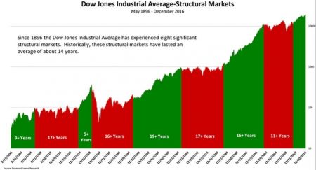
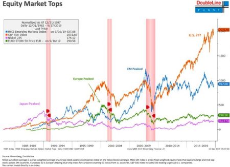
The data in the chart above is over a timeframe when the U.S. went from an emerging power to the most powerful force in the world for the latter 70 years (rather a favorable data set). Not an unbiased sample. If we look internationally, the Japanese stock market peaked 30 years ago, Europe peaked more than 20 years ago and Emerging markets peaked 17 years go.
Chris Cole of Artemis Capital would remind us that 94 percent of the gains of the U.S. stock market has come from 1984 until now. In essence, we have gone from a brutal Fed policy with Volcker willing to induce a double-dip recession to break the back of inflation, to the Greenspan/Bernanke/Yellen/Powell policies where anything and everything will be done to increase the prices of financial assets.
So, if you want to take Mr. “Stocks for the Long-Run” Jeremy Siegel’s advice (who Charlie Munger called “demented”), be my guest. You just have to understand that from today’s prices in the U.S., it’s very possible that you experience a disappointing decade plus.
II. Professional Manager Aggressiveness by Several Important Metrics is the Highest Ever
As of mid-December, the cash in portfolio-manager accounts was down to an all-time low of 2 percent (Dec. 16th 2020, David Rosenburg.)
Sentiment indicators are also at or near all-time optimism – AAII (bullish) NAIIM (near records) HF (near record net/gross), Single stock shorts (near lows)
Of course, portfolio-manager optimism is a big contrarian indicator. After all, they control the majority of the money in the capital markets, so if they are at their optimistic extremes, who is left to buy?
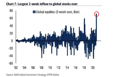
III. Retail Investor Euphoria by Several Important Metrics is the Highest Ever
There was one person left to buy – the little guy. Retail investors don’t usually move the markets very much, except when they all get in a frenzy in the same direction. The combination of checks from the government and idle time coinciding with the trough of the markets in March has created “can’t lose” attitude among retail investors. They have opened brokerage accounts in record amounts.
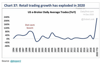
In fact, they are so optimistic, they are borrowing the most ever to buy stocks (not a good idea even in the best of markets).
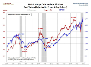
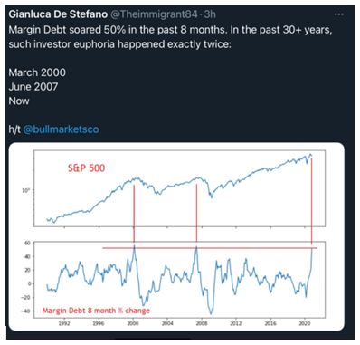
Margin debt has increased so quickly in 2020, there are only two other times in the last 30 years to compare it to. March of 2000 and June of 2007, some of the worst months to be aggressive in U.S. history.
The “can’t lose” attitude is everywhere from “Rare Ferraris rose 14 percent last year and colored diamonds appreciated 11 percent in value. A case of Château L’Eglise-Clinet 2010 Bordeaux soared 37 percent in 2020” (from David Rosenberg on 1/5/2021). U.S. housing has been on a spectacular run as well.
Even Bitcoin (an asset I still struggle to understand why it has any value at all; one that Charlie Munger called “worthless artificial gold”), was up ~50% in 2020.
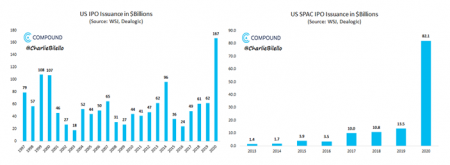
IV. IPO Issuance (When Combined with SPACs) has Eclipsed 2000 and is the Highest Ever
The Wall Street IPO & SPAC machinery broke records in 2020. For those of you who don’t know, a SPAC is a Special Purpose Acquisition Company, which is a way of saying you invest in a blank check. You give your money to a fundraiser (sometimes somebody famous and credible, and sometimes not) without knowing what the end investment is. You just trust they will find something worthy to buy.
The Wall Street fees associated with this issuance of stock, both IPOs and SPACs, are huge. A Stanford University paper, “A Sober Look at SPACs,” estimates that 33 percent of the cash investing in SPACs go to fees. The public is buying increasingly suspect businesses (there’s only so many good ideas at any given time) and at increasing prices. Not a good combination!
According to Grantham (Jan 5, 2021), there has been a total of 480 IPOs (including 248 SPACs) compared to 2000 when there were “only” 406 IPOs.
V. I Personally Think the Amount of Fraud and Misleading ‘Adjusted’ Numbers Coming from U.S. Companies is Among the Highest Ever
This one is harder to pinpoint, as nobody cares about frauds when stock prices are going up. Most of the major frauds of history were uncovered because people started losing money in their investments and wanted answers. This is why the fraud cycle is correlated to the stock market cycle. However, consider a few data points.
Jim Chanos, the most famous name in short selling (betting against stocks), recently said his portfolio has 3x the normal number of frauds. So, he’s not betting as much against companies with broken business models, bad management or maybe obsolete products; he’s more than ever finding frauds to bet against.
CNBC wrote a story in 2019, pointing out that more CEOs lost their jobs to “ethical issues” than at any other time in the 19-year history of the survey.
The following paragraph was written by FMI Funds in December of 2018, and is a wonderful short explanation of common number fudging that is rampant today:
In summary, it is impossible to know how much fraud is lurking below the surface, but with the government being so permissive and the amount of “adjusted” numbers floating around, “Caveat Emptor” should be the saying of this era!
VI. Bond Prices with More Than $18 Trillion of Negative Rate Bonds are the Most Expensive Ever
The nice aspect of bonds is their valuation is more straightforward than stocks. As of the end of 2020, we crossed the $18 trillion mark of negative yielding bonds.
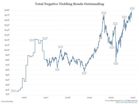
Of course, bond yields and prices are the inverse of each other. So, the negative yield above is simply saying the overall bond market is its most expensive ever (and we have thousands of years of data on interest rates). Does all this negative yielding debt make sense? No. It is Central Bankers taking a simple and powerful concept (that lower rates will spur economic activity by decreasing the cost of lending) and taking it to an absurd extreme.
Perhaps even harder to believe is that according to economist David Rosenberg, there are more than $3 trillion of corporate bonds with a negative yield! (Early Morning with Dave on Dec 12, 2020)
But there is never a free lunch, right? If we assume a “normal” rate for bonds is 3 percent, this extreme can-kicking is costing savers ($18T x 3%) $540 billion a year, not including all the other dollars that use government rates as a point of reference.
VII. Corporate Credit-to-GDP is the Highest Ever
The U.S., and a lot of countries, entered the Coronavirus crisis with a near record amount of corporate debt on the books. They countered their 2020 struggles by raising more debt than ever before.
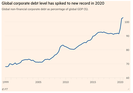
Matt Brill of Invesco (Bloomberg 1/11/21) estimates that U.S. corporate debt grew near $1.8 trillion in 2020. An astonishing amount considering all the corporate debt built up before 2020 was about $10 trillion. Of course, if all that debt is being used to invest in things that will inrease the profitabiilty of firms in the future, it may not be a problem. But if that debt is merely “filling a hole” created by the Caronavirus or if companies are spending it on unproductive things (like very expensive buybacks and acquisitions), then all that debt just increases the fragility of the system.
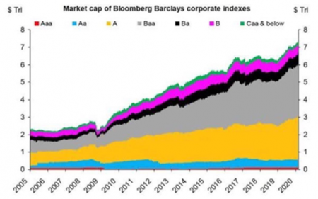
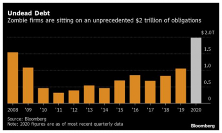
VIII. The Quality of Corporate Debt is the Lowest Ever (More Firms are One Notch Above Junk than Ever)
The other issue regarding corporate debt is not just the amount, but the quality of it. As you can see from the chart below, there are an increasing amount of firms ranked one notch above junk (Baa – the grey area). Almost $2 trillion of that debt is tied to “Zombie” firms (companies who don’t earn enough money to pay their interest).
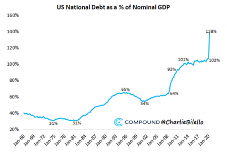
IX. U.S. Government Debt as a Percent of GDP is the Highest Ever
This is so known. I won’t spend much time on it. Both the level of government debt in the U.S. and many other countries is unsustainably high.
The chart above significantly understates our government’s problems. In the paragraph below, multi-decade successful manager David Iben quotes trading legend Stan Druckenmiller:
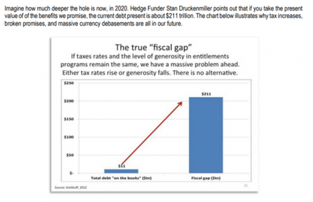
This you’ve heard ad nauseum, the U.S. government has simply promised too much relative to the size of our economy.
X. The Federal Reserve’s Money Printing is the Highest Ever
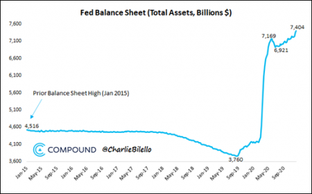
What do you do when you have a grossly overleveraged economy and the world “stops,” as it did in March? When I say the financial world stopped in March, I don’t say that flippantly. According to former Fed insider Danielle DiMartino Booth, there was a night in March where there were no bids (people looking to buy) for U.S. Treasuries – supposedly, the safest asset in the world! This is something that didn’t happen even in the depths of the 2009 financial crisis.
So, what do you do if your Chairman Powel and the world stops? You print like you have never printed before and inundate the capital markets with cash. As you can see from the chart above, roughly $4.3 trillion in about 30 days. A very hard-to-imagine number.
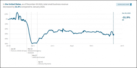
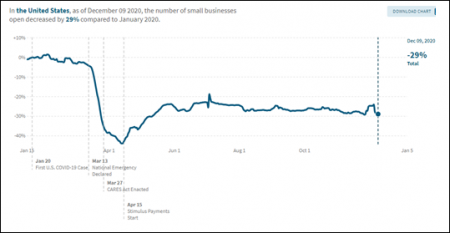
XI. Small Business, Which Employs Roughly Half of Americans, Closings are the Highest Ever
Small businesses have suffered immensely through this pandemic. Through early December, 29 percent of businesses are closed (we don’t know how many are permanent) and revenue is down 32 percent. These are Great Depression-type numbers. Yes, they are particularly suppressed due to temporary COVID numbers, but this is also leaving a lot of scars that will be felt for years to come.
XII. The Performance and Now Valuation Difference Between Glamour ‘Growth’ Stocks and Hated ‘Value’ Stocks is the Most Extreme Ever (A Great Thing Going Forward for Value Investors!)
I couldn’t find an updated chart, but as of early 2018, more than 10 percent of the Russell 3000 was trading at 10x sales. The absurdity of paying 10x, 20x or even sometimes 30x sales for a decently large tech stock is quickly obvious when you look at this chart:
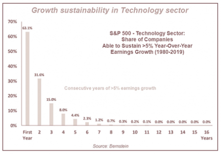
Many investors conflate historical performance with future performance. It seems like a no-brainer to buy the “winners” of the era, but the mega-caps are mega-caps because they did win, and now everybody is gunning for them and copying their methods. Look at that chart above. If you pay a multiple where a tech stock has to grow quickly for 10+ years, you have a roughly 0.2 percent chance of that working out for you (aside from selling to the proverbial “greater fool”). Daunting numbers!
Value stocks consistently benefit by having not much expected of them (at least relative to growth). Today, the disparity between the two is as extreme as 2000, and by some metrics, more so.
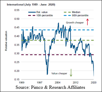
As you can see the valuation difference, both in the U.S. and abroard is extreme. In fact, it’s so extreme, you can have very modest expectations for value’s rebound and still experience nice to great returns.
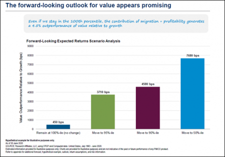
Research Affiliates (a value shop talking their own book, so take it with a grain of salt) estimates that if “Value” remains in the duldrums (i.e. 100 percentile of historical cheapness), it would still outperform growth by 4.5 percent annually, due to the structural advanages of Value, namely being cheap relative to things like earnings. If “growth” falters, then we can hope for double-digit returns.